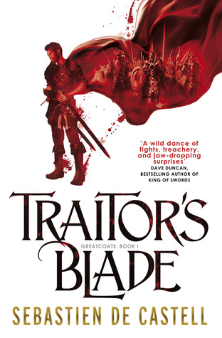
I’m off of work for a week and a half due to cancer stuff, so I’m finally going through my email and responding to things people have sent me. One such email was from Sebastien de Castell’s States based PR Guru giving me the cover art for the US version of his book Traitor’s Blade (to release in the States on July 15). This cover made me stop and think for a minute. It’s a very different feel from the UK cover (which is the book I got in the mail a few months ago). The thing is, now that I have publishers contacting me from both sides of the Atlantic Ocean, I’m realizing that cover art changes dramatically from country to country.
I’ll be the first to admit that I don’t have a clue when it comes to covers. I don’t know why certain covers look a certain way in certain countries. I don’t understand why the feel of a cover can change so much from place to place. I don’t get it. For an example of what I’m referring to, here are some covers that have recently sparked my attention – the US and UK counterparts for the same book.
Anyone care to educate me as to why covers change so much from country to country? Is there even a reason behind that? Or does it just happen?
Do you tend to prefer one country’s covers more than another? Why? Why not?
Any thoughts, or is this something that I think is strange/interesting because I’m weird?
—


8 Responses
Interesting question, and I’ve wondered this myself. I think there must be some subtle cultural thing going on, because I generally (though not always) prefer the UK cover (I am UKish). But this is complicated for me by a preference for hardbacks- so often difficult to decide which one to get.
Anyone care to educate me as to why covers change so much from country to country? Is there even a reason behind that? Or does it just happen?
Different schools of cover art thought, chances to give local artists more work, perhaps. There are also distinct aesthetic concerns. I can’t imagine Baen covers flying very well in the UK, for example!
Each side believes they understand what works best in their own market, and they design their covers accordingly.
Sometimes I find that one draws my attention far more than another, but there doesn’t seem to be a running pattern. Sometimes UK ones work well for me, sometimes US, sometimes I’m drooling over the random German or French cover art that I stumble across.
Personall, for Traitor’s Blade, I like the Canadian cover the best: http://d.gr-assets.com/books/1387821767l/18804867.jpg
The thing that I find more perplexing is why do they sometimes change the title of the book? eg Ben Aaronovitch’s Rivers of London is called Midnight Riot in the US. Peter V Brett’s The Painted Man had to become The Warded Man in the US. Maybe a “painted man” sounded like a man wearing makeup to Americans, but what could be objectionable about “Rivers of London”? It makes things confusing for readers, so I would have thought there’d have to be some really compelling reason to do it, not just a minor preference.
I totally don’t understand the big cover differences. I find I frequently prefer the UK cover as well. So much so that I’ll not seek to find what it looks like because I have a compulsive buying problem. Like given the above I favor the UK covers mostly but like the U.S. ones as well. Except the first, I don’t fancy that one at all.
Like many people here, I often prefer UK covers, latest example being Price of Fools by Mark Lawrence. But very often, French, German and Portuguese covers are by far superior. E.g., art by Marc Simonetti and Stephan Martinière is often overlooked by both US & UK publishers…
I know we shouldn’t judge a book by its cover but it’s the first thing that catches our eye. We can’t avoid being attracted to a book with a great cover… it’s not that simple.
Although a publisher is certainly aware of this, customary variety among these covers remains a mystery to me.
Of your list I only like the US more on God’s War and Gemsigns.