The Overview
Well, this weekend my thirty books for the SPFBO arrived. I’ve been poking around in my stash all day, mentally organizing them, going over my system and various things like that.
Mostly, my system will be the same this time around, with one exception. I will still write a mini review for each book, but I’m not going to make myself read each word of each book like I did before. I enjoyed doing that, but it took up a lot of time. If a book doesn’t wow me within a certain amount of time, I’ll put it aside. It will still get a mini review. It will still get an award (people seemed to really like that last time around and I liked doing it), I’m just not going to make myself read every word of every book unless said book is unputdownable.
There is only so much time…
Other than that, things will basically be the same. I’m going to break my pile up into manageable chunks, randomly (My husband is the randomizer. I’ve assigned each book a number and he’s randomly picking the numbers that go into each group. He has no idea why he’s picking numbers, he just is, and that works for both of us.) Each round will have a winner of that round. In the end, I will pick a winner based off of my own inner juju.
Wow, isn’t that scientific.
As soon as I’m done organizing my manageable chunks, I’ll write another post saying what book will be in what chunk, so if you’re interested you’ll know what to look for in what week (unless life happens and my reviews/reading gets delayed).
And there you go. I am really, really excited to start on this.
The Cover Art
Last year in the SPFBO Round 1, I learned two important things:
- Money spent on a professional editor is SO WORTH IT.
- Money spent on amazing cover art is SO WORTH IT.
Today I’ll address cover art (in a general way), because really that’s just about as far as I’ve managed to get so far in my organization process. They say first impressions are the most important, and I can tell you that cover art is your first impression. If the cover on the book is fantastic, I’ll be so much more likely to actually be interested in it, pick it up, and open it. Your cover art represents your book. You don’t want something paltry and thrown together to represent a book you’ve spent so much time, energy, and emotion on, do you?
I didn’t think so.
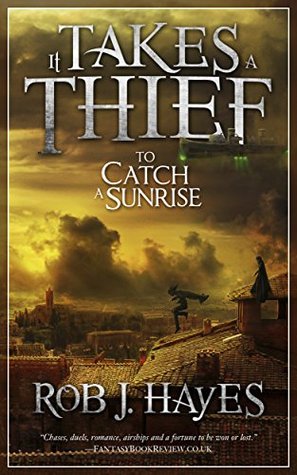
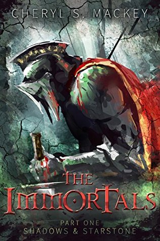
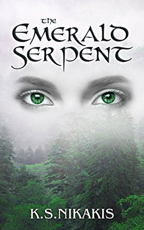
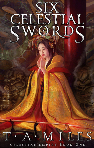
I had some epic cover art last year, and I have some that have bowled me over this year. Just for fun I figured I’d show you some of the cover art in my stash that impresses me the most (so far). For a first impression, these authors nailed it. I’m not going to put an About the Book up (mostly because I just got the books today, worked a full day, had two kids that demanded to be entertained, did some photography business stuff, and had to do other things like eat and exist, so I just haven’t had time). You guys can click on each cover for their respective Goodreads pages to learn more about them yourselves.
To summarize, cover art matters. It’s expensive and takes time to create, but that is money and time well spent. It will help sell your book. It will get people interested in your book. It represents your book.
Now, onto specifics.
I was floored when I started browsing through this year’s batch. There are so many books with fantastic cover art in my group! I’m amazed!! The quality is so high, I had a hard time picking some favorites to show. I like being wowed, so looking at my books has been a thrill. I will say that just because some books are shown here, does not mean that these are the only worthwhile covers I have in my batch. I honestly had a very, very hard time narrowing down a handful to show off. You’ll see the rest when I write up my mini reviews.
I will say, if the actual text of these books follows the quality of the cover art, then I highly doubt I’ll be “Did Not Finish”-ing any of my books. I hope that’s the case!
Keep in mind, art is funny. What pleases me, might displease you. My opinion, unfortunately, is not gospel.
Anyway, onto the covers (in no particular order).

Bring on the SPFBO Round 2!


6 Responses
Oh wow, you’ve got some gorgeous books in your batch this year! I’m checking out the descriptions for them, and I’m looking forward to seeing what you eventually think of them after reading.
Here’s to another great year of pseudo-agenting!
I really do! I’m excited to get started!
These are some great covers.
Your favorite is my favorite!
Good cover art and good editors make a tremendous difference in how the book is perceived by readers, and whether or not a reader reads past the first pages.
The covers are incredibly impressive this year! My favorite at The Blood-Tainted Winter and The Immortals (whose font reminds me a lot of Obsidian and Blood trilogy by Aliette de Bodard), but I have an interview coming out next month wth Benedict Patrick, author of your favorite cover 🙂
All fabulous. Favourite is Ravinor – the ring is Tolkien-ish, the beast’s claw reaching out is an invitation to open the book. Great choices.